


Description
-
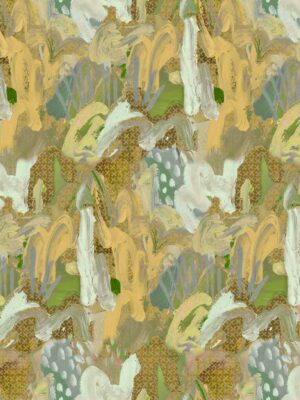
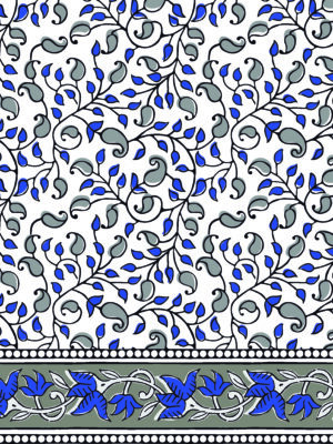
Visual Dispersion (Mechanical): The design exhibits a masterfully controlled “Fluid-to-Friction Hybrid Dispersion.” The background color blocking mimics the smooth, blooming behavior of liquid mineral pigments diffusing into a fine textile ground. However, the fine black and white line paths layered over the foliage surfaces completely reject this bleed, maintaining 100% graphic sharpness to support clear translation onto rollers and digital screens by your computer office team.
-
Pigment Dispersion (Zonal): The design utilizes “Zonal Tonal Partitioning.”
-
The Shaded Surfaces: Utilize a “viscous-to-vaporous” gradient dispersion, where the sage and rose fields transition from deep, saturated centers into delicate, semi-transparent satin edges.
-
The Focal Accents: Utilize a high-opacity “flat” dispersion along the bright terracotta-orange leaf tips and deep teal spines, anchoring the layout and pushing the lighter elements into crisp relief.
-
-
Edge Dispersion (Sharp-Path Transition): The boundaries feature a “Defined-Graphic Transition.” Form is defined by the absolute energy of the structural perimeters rather than loose color fields. The edges of every primary leaf possess clean, sharp-cut boundaries, guaranteeing perfect pattern tracking and structural integrity for large-scale saree and kurti paneling.


Reviews
There are no reviews yet.