


Description
-
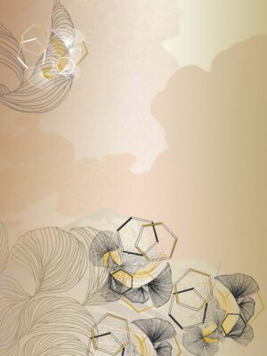
Visual Dispersion (Sheen): This is a prime example of low dispersion light. The “light” in the image doesn’t diffuse softly (like in a misty watercolor); it hits the ridges and reflects sharply. This “tight” dispersion of light is what tells your brain the material is hard and shiny (metal) rather than soft and matte (cloth).
-
Gradient Dispersion (The Flow): Look at the large, dark grey curves of the leaves. There is a very smooth gradient dispersion from black to silver. This represents the curvature of the metal. The ink/color must disperse perfectly evenly to create this sleek, automotive-finish look.
-
Edge Dispersion (Zero): The edges of the leaves are razor-sharp (Zero Dispersion). There is no bleeding or fuzziness. This reinforces the “cut metal” aesthetic.


Reviews
There are no reviews yet.