


Description
-
Visual Dispersion (The “Wash”): The beige/tan parts of the flower show high dispersion. The pigment appears to be dropped onto wet paper, causing it to spread outwards softly and fade into the background. This gives the flowers their “ghostly” or soft volume.
-
Lack of Dispersion (The Lines): The black contours show low dispersion. They are sharp, crisp, and high-contrast.
-
The Design Intent: The beauty of this print comes from the contrast in dispersion: the soft, spreading, undefined beige color versus the sharp, defined black structure.
-
Key Features:
-
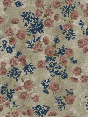
Palette: Neutral and monochromatic (Beige, Tan, Sepia, and Black).
-
Technique: The black lines are “gestural” (loose and scribbly), creating an energetic, raw feel. The color fill is deliberately messy, spilling outside the lines to create an artistic, “unperfect” look.
-


Reviews
There are no reviews yet.