


Description
-
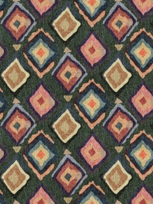
Visual Dispersion (Internal): Inside the blocks, the pigment shows High Textural Dispersion.
-
The Effect: Look at the pink block on the left with vertical white streaks. This is “Friction Dispersion” (dragged paint). The green blocks show “Noise Dispersion” (speckled/gritty). This creates a “worn” look, preventing the geometry from feeling too digital or flat.
-
-
Edge Dispersion (Zero): The boundaries between the blocks have Zero Dispersion. They are razor-sharp. The messy texture stops abruptly at the edge of the rectangle.
-
Technical Note: This is crucial for printing. If the edges were blurry, the design would look out of focus. The sharp edges act as a “container” for the messy textures.
-
-
Pattern Dispersion: The visual interest is dispersed rhythmically. The eye jumps between the “quiet” blocks (solid colors) and the “loud” blocks (stripes/grunge), creating a balanced composition.


Reviews
There are no reviews yet.