


Description
-
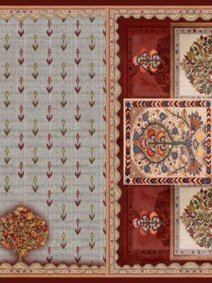
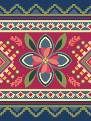
Visual Dispersion (Mechanical): The design exhibits a pristine, production-ready “Zero-Bleed Screen-Print simulation Dispersion.” The pigments are applied to mimic the uniform, high-opacity distribution of fine textile screens or copper plates. Each color territory remains completely isolated within its sharp perimeters, entirely avoiding any muddy tonal bleeding or ink overlapping. This ensures the intricate, multi-colored intersection stays crisp and highly legible for large-scale fabric production across your brand’s collections.
-
Pigment Dispersion (Zonal): The design utilizes “High-Contrast Zonal Saturation.”
-
The Ground Fields: Utilize a solid, flat, low-bleed dispersion—the neutral sand-beige base provides a stable, light-reflective surface that pushes the vibrant crimson and azure tones forward into intense graphic relief.
-
The Floral Inlays: Utilize an uncompromised “zero-mottle” flat dispersion, where precise multi-tonal block steps provide depth to the layered petals without relying on hazy watercolor gradients.
-
-
Edge Dispersion (Sharp-Path Transition): The boundaries feature a “Defined-Graphic Transition.” Form is established entirely by the absolute energy of the crisp perimeters rather than loose gradients or fluid washes. Every single leaf contour, serrated petal edge, and scrolling stem path carries a razor-sharp boundary against the beige ground, ensuring flawless repeat configuration and seamless panel engineering for your office team’s saree borders and kurti layouts.


Reviews
There are no reviews yet.